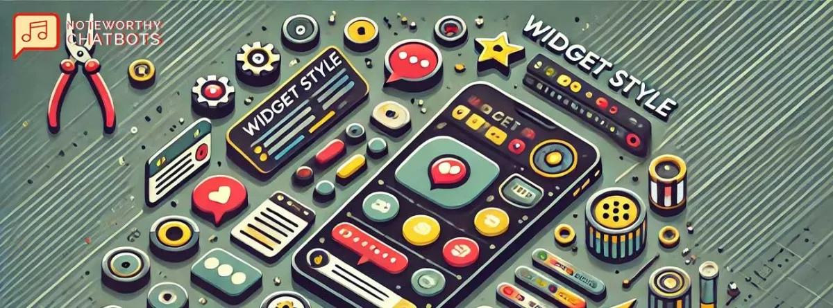
Dashboard - Widget Style Settings
Every chatbot you build can be customized to meet your brand requirements or those of your client.

Position
You have the option to align your bot to the bottom left or bottom right of the page.
Widget Title
This is the text located at the very top of the chat window and to the right of your chatbot's avatar icon.
Welcome Message
This is the text that appears first in the chat window. It's your greeting and your opportunity to spark a conversation with your potential client.
Call to Action
This is the text that catches your visitor's attention and makes them aware of your chatbot. It also has an audible notification sound to attract their attention to the bot icon and entice them to start a conversation.
Appear On
You can configure where your chatbot appears on your site, with two options:
1. All Pages. The bot appears on every page on the website where the integration code exists.
2. Specific Pages: with this option selected, you must enter options in the “URL must contain“ field. This is a comma-separated list of words that must be found on a page for the chatbot to appear on that page.
Fallback Message
This text is shown to the site visitor when the chatbot doesn’t know how to answer their question. This could be a direction to reach out to your support email or schedule a meeting or any other call to action that is appropriate.

Avatar
This is the image that displays on your chatbot's notification window, and in your actual chat window. Circular images work best. If your logo is square, make sure you add white space around it so when displayed inside the chatbot icon, the entire logo is visible.

Theme or Custom Color
This is the background color of your widget and chatbot icon.
Choose from the four pre-configured options, or use the hex code of one of your brand colors.

LEGEND


